
Sean Walker
2020-06-19
I don’t know if you’ve seen the new HEY email service yet, but you should take a minute to watch this video or at the very least, take a look at this screenshot
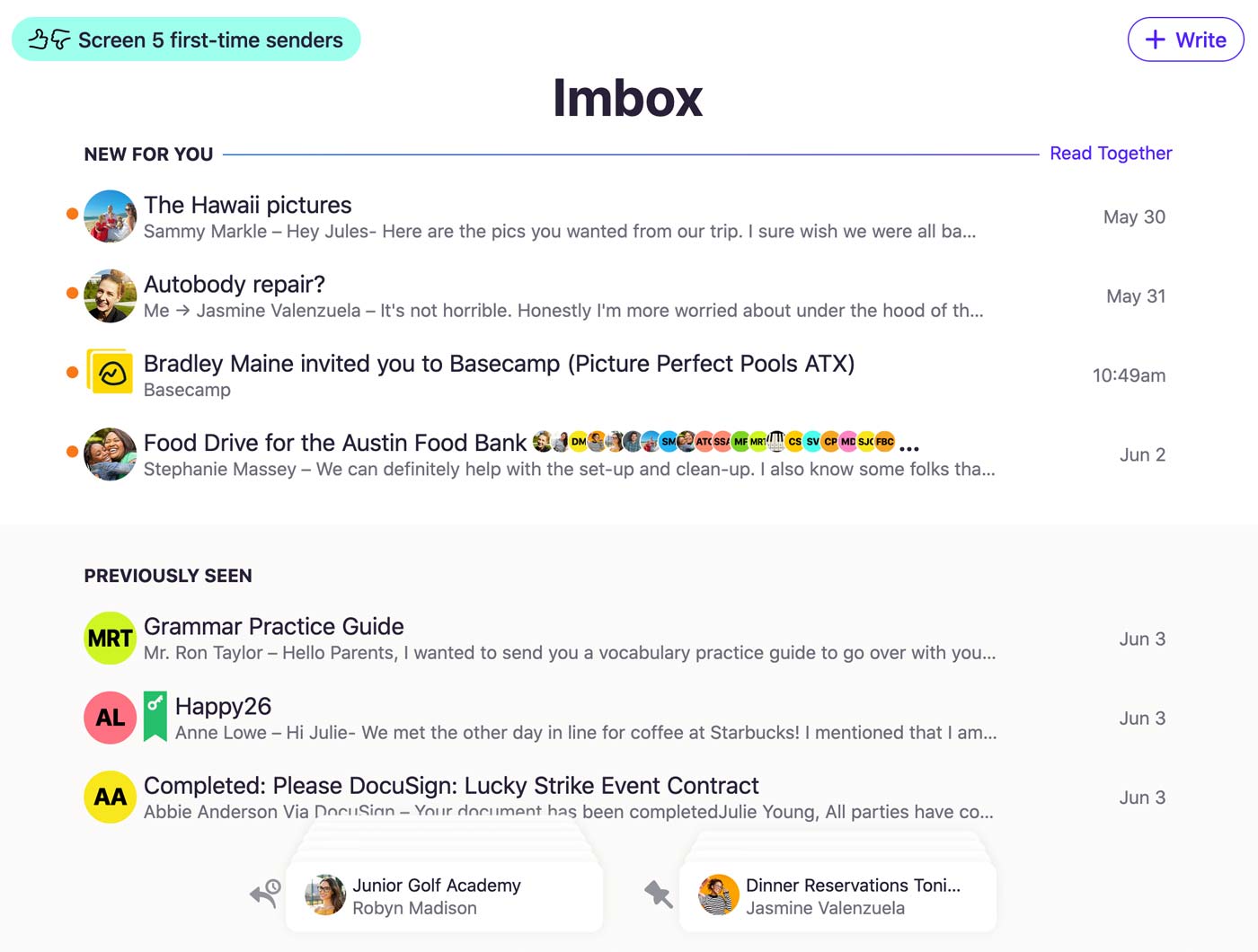
So a few things jump out at me immediately. The first is, WOW this is a clean design. It’s pretty effortlessly 2020’s aestethic. Barely any borders, almost same font weight throughout, circle photos everywhere, and a TON of whitespace. It looks great! The second thing that really stood out to me was the “stacks” at the bottom.
It’s been quite a few years of apple telling us that navigation tabs go at the bottom of things, but they depart from this in a way that makes almost more sense. I mean what do you normally see after you hit a tab icon with some text? More info, and then you might navigate by tapping a photo or a list item or something be presented with a little back button at the top left of the screen? That’s actually terrible. You have shimmy your hand up the phone to reach it or worse, come over with your other hand and tap it. It would be better, if you never even lost your “place” and you could get a glance at the data behind that tab bar button before you even tapped it.
That’s probably one of the most exciting things to me about this design that I’m not sure anyone is really that excited about. It’s essentially data driven or dynamic ui navigation instead of static. The stacks are built by you and contain the things you care about, AND they don’t require you to navigate away to another boring list view.
One last thing that really stands out to me before I go into a mini-rant about how server-rendered (as in html from the server) apps are the future, is that there doesn’t appear to be a traditional form anywhere in this app, and that’s a good thing. No one likes forms, they were mostly created for governments to request information from people and somehow managed to make their way to the web. It’s much better to not have anything that resembles a form in your app, if you can do it.
HEY’s UI is 100% HTML over the wire. We render plain-old HTML pages on the server and send them to your browser encoded as text/html. No JSON APIs, no GraphQL, no React—just form submissions and links.
— Sam Stephenson (@sstephenson) June 15, 2020
This way of working is tried and true. We collectively took a detour with really, really complex things like front end frameworks, graph query languages and the like, but it’s good to see that a really gorgeous, fast (< 100ms interaction time between “page” loads) can and was built using the classic three tier architecture. What’s funny is I was also swept up in the hype around 2016/2017 with react and friends and I regret introducing it to my company at the time, it’s a lot of garbage for not a lot of gain. You can essentially emulate the perceived performance from a single page app with the following list of libraries:
Not to mention, these libraries require very little js, and in some cases no server side participation at all. The best part is that browsers have to do very little work updating the different pieces of html across containers, it’s as easy as setting innerHTML. I started out this year pissed off at what web development has become, but I’m starting to see the light at the end of a very long, very winding tunnel. Turns out that in order for web development to be fun and productive again, we just had to go back to the future.